— Links
— Link
— Link
— Link
— Link
— Link
— Link
— Link
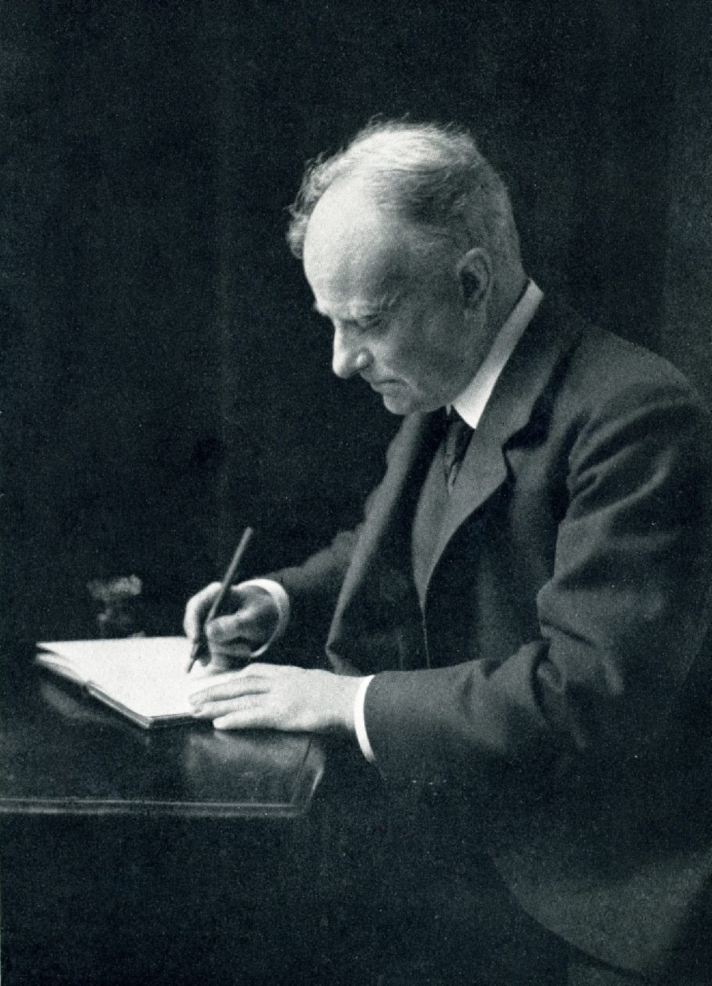
Thomson working at his desk in 1912.
Hoppé - Spielmann, M. H. Hugh Thomson, his art, his letters, his humour and his charm. London: A&C Black, Ltd. 1931.
Hugh Thomson's Peacock edition of Pride and Prejudice pdf
https://archive.org/details/prideprejudice00aust
I have downloaded high res version of all the pages.
prideprejudice00aust_raw_jpg
https://en.wikipedia.org/wiki/Hugh_Thomson
Thomson died of heart disease at his home in Wandsworth Common on 7 May 1920.[2]
Cranford School
Thomson was the first of the Cranford School of illustrators who abandoned the 1890s style of Beardsley for the delicacy of an eighteenth-century mode.[11] The 'Cranford School' of illustration was not so much a 'school' with a common training, but more of a style which celebrated a sentimental, pre-industrial notion of ‘old England'.[12] The style was named for Thomson's illustrations of the Macmillan reissue of Mrs. Gaskell's Cranford. Cranford was the first of a series of 24 volumes, of which Thomson illustrated 11.[13] Felmingham includes the Cranford School within a broader movement that he called the Wig and Powder School which he states reflected an aspect of contemporary taste that . . . is sometimes called the 'Queen Ann revival'. Felmingham included the popularity of such architectural features as high-pitched roof, Flemish gables, and white or green painted sash windows as an outward expression of the revival.[14] Jenkins states that the term Wig and Powder School is loosely equivalent to the Cranford School and that the latter term was mostly used between 1890 and 1914.[note 3][15]
The style was a nostalgic, affectionate and slightly whimsical approach to historical themes.[16] and was distinguished by graphic nostalgia for a philistinism that was no more.[17] The members of the school had all been fired by the literature, art, costume or atmosphere of England in the eighteenth century and became dealers in nostalgia on a very large scale.[18] It was a style of illustration harking back to pre-industrial rural England,[19] which specialized in the nostalgic recreation of a by-gone golden era before the ravages of industrialization.[20] Cooke notes that the style involved the careful representation of Regency dress and interiors, pastoral settings and sharp characterization which was based on a close reading of the text.[12] The emergence of the Cranford School style was only possible because photo-mechanical reproduction of drawings allowed the fine pen lines distinctive of the school to be reproduced, which was impossible with the older technique of wood engravings.[16]
Start of Chris Beetles synopsis:
Hugh Thomson, RI (1860-1920)
‘pen drawings by Hugh Thomson can be said with reasonable justification to mark the beginning of a new era in English book illustration’ (Edward Hodnett, Five Centuries of English Book Illustration, Aldershot: Scolar Press, 1988, page 187)
The Irish-born artist, Hugh Thomson, helped introduce a new approach to illustration through his closely observed and carefully researched pen and ink drawings. He was particularly associated with editions of classics of and about the Georgian and Regency periods. However, his versatility enabled him to capture both contemporary life and native topography with a relaxed energy.
Hugh Thomson was born at 9 Church Street (now Kingsgate Street), Coleraine, County Londonderry, on 1 June 1860. He was the eldest of the three children of John Thomson, a tea merchant, and Catherine (née Andrews), a shopkeeper.
Two or three years after the death of Hugh’s mother in about 1871, his father married Maria Lennox, a widow with one son, of the Manor House, Kilrea, about 14 miles south of Coleraine. John Thomson settled in Kilrea, and opened a drapery, haberdashery and hosiery warehouse in Maghera Street, though left the running of it to his wife as he pursued other business interests.
Hugh attended Coleraine Model School and, while there, often stayed at Breezemount, with his maternal aunt, Jayne Hunter, becoming very close to his cousins.
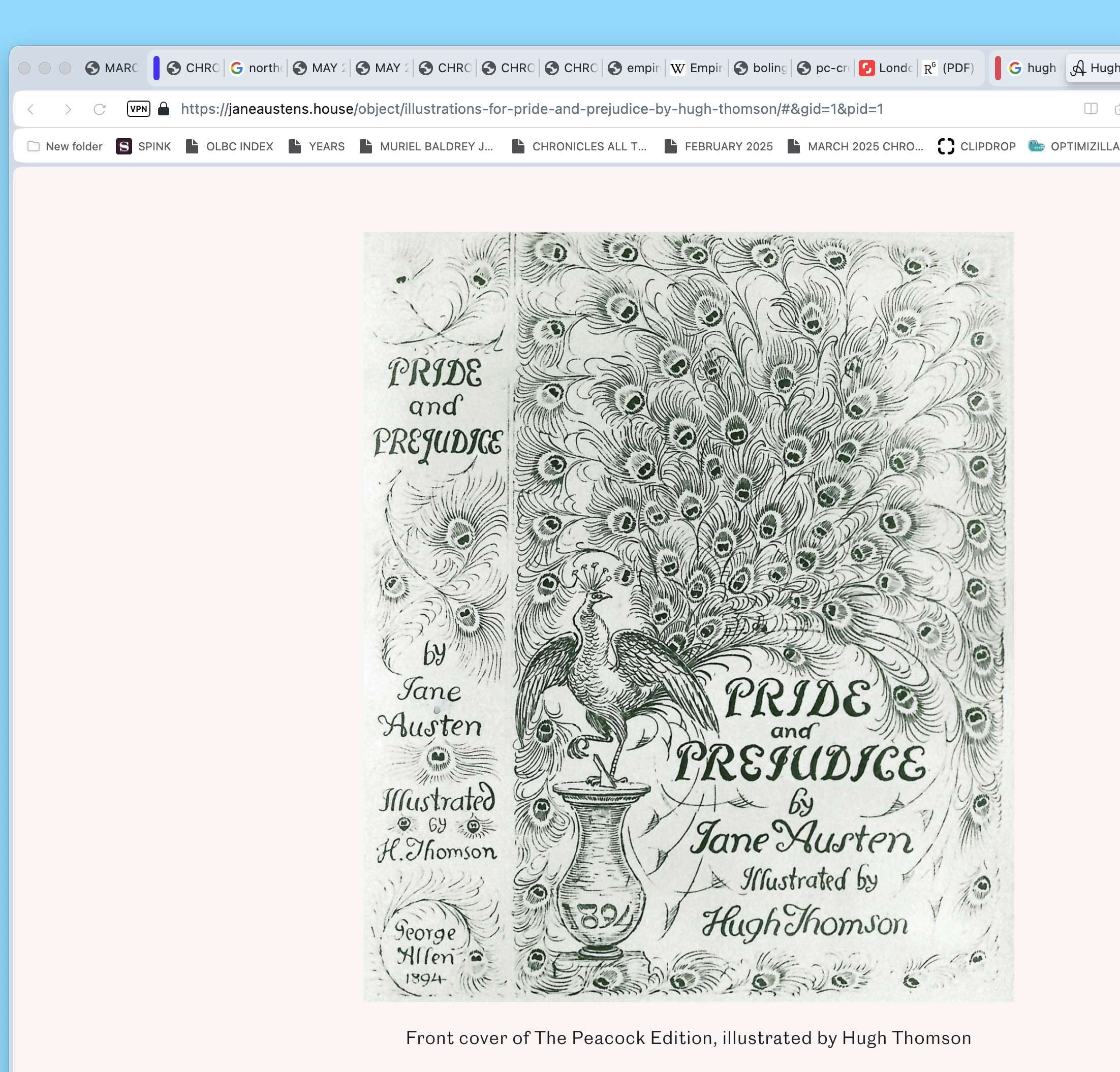
A collection of 35 illustrations by Hugh Thomson, made up of three original pen and ink drawings and 32 printers test proof plate prints, made for for George Allen’s 1894 edition of Pride and Prejudice. They are signed by the artist and dated ’94 (1894).
Made: 1894
Context: Hugh Thomson was one of the most popular Victorian illustrators, and his lavishly illustrated edition of Pride and Prejudice for George Allen, known as The Peacock Edition, became one of the most collectible editions of any book ever produced.
As well as the lavish cover illustration, featuring a peacock perched on top of a sundial, Thomson also created over a hundred line drawings to illustrate the story, ranging from Darcy and Bingley visiting Meryton, to the formidable Lady Catherine de Bourgh.
This edition was not the first attempt to add illustrations to Austen’s novels, but with 160 illustrations (including headpieces, tailpieces and ornamental initials) it was the first to fully integrate them into the novel to bring the story to life.
https://janeaustens.house/object/illustrations-for-pride-and-prejudice-by-hugh-thomson/
Front cover of Pride & Prejudice ‘Peacock’ edition, illustrated by Hugh Thomson 1894
Firstly, we have the famous illustrations of Hugh Thomson, first published by George Allen in 1894. This edition of Pride & Prejudice is often referred to as the ‘Peacock’ edition, due to Thomson’s gorgeous illustration of a peacock on the front of the cover. Although this edition of the novel was not the first to have introduced illustrations to accompany the text, it is the first to have been fully illustrated throughout, showing all significant encounters in the storyline. This edition included 160 illustrations, not simply limited to the main character illustrations but also including decorative chapter headings which really encourage the reader’s imagination to run wild.
Illustration of Darcy meeting Elizabeth, by Hugh Thomson
Thomson’s interpretation of Mr Darcy giving Elizabeth Bennet his letter reflects the Victorian fashions of the time. Darcy’s ruffled cravat and coattails waving in the background, and Elizabeth’s parasol and feathered hat truly reflect the Victorian era the illustrations were drawn in. As well as this, Darcy’s action of tipping his hat enhances his position in polite society as a traditional gentleman.
https://janeaustens.house/online-exhibition/the-illustrations-of-pride-prejudice/room-1-hugh-thomson/
Hugh Thomson Illustration Collection: Online Exhibition
YouTube: https://www.google.com/search?client=opera&q=hugh+thomson+illusrator+artists&sourceid=opera&ie=UTF-8&oe=UTF-8#fpstate=ive&imgdii=FTBBD4iOlwVKtM&imgrc=06tAcXJ7dEmU6M&vld=cid:3df9ff8c,vid:54RNTE4JSx8,st:0
·
CultureNI
·
10 Oct 2010